Thursday, 8 November 2012

How To Create a Great Blog Post By Using Structure


Blogging is the way to bring potential clients to your web site. Search engine optimisation, good web site design, high quality services and products and outside links and recommendations are all essentials as well, of course, but none of them will draw search engines and users to your site, in the numbers you want, without fresh, original content.
In the nine months that I've been curating web articles, and the months before that where I've been researching how to set up my business, I've read a lot of blog posts. I've now reached the point where I've started writing short articles on the internet myself. So here is my outline structure of a blog post:
  • The background to the topic. This should be researched, accurate, relevant and lead into:
  • The reason for the article. Make this personal and relevant to the reader.
  • More in-depth background. This should support:
  • Your thesis. This is a summary of the main point of the blog post.
  • A more detailed description of your thesis, supported by reasoning and evidence.
  • The implications of your thesis and why these matter to your reader.
  • A short, punchy summary of the thesis and the implications.
  • References and links to your research and evidence.
Some general advice:
Link to your evidence. Do this within the body of the text. Remember, this is blog post, not a magazine article. Take advantage of this! Don't put 'click here' after every phrase, use the text itself as a link. It's not only more elegant, it's better for search engine ranking. More advanced bloggers know to use key ranking phrases as links in the body of their articles.
Be authoritative. Don't speculate, demonstrate! Use accurate statistics but don't blind with science. Speak the language of your reader. If in doubt, think of them as an intelligent, interested adolescent.
Be succinct. Aim for about a five-hundred word length. If you go longer than that, think about splitting your article into more than one post.
Be constructive. I can't tell you the amount of times... NO! If you think you have a better idea about something, then show us how to do it. Don't complain about how others don't.
Be original. Use other resources for your research (and credit them) and have your say on current topics, certainly, but have a point to make that is uniquely yours. If you find that everything you want to say has already been said, then perhaps your post should simply be a list of reference to other sources that you find useful. If even that has been done, you should probably just forget the whole idea.
Don't worry too much. In particular, don't be too concerned about being wrong. This is an editorial, an opinion piece. As part of your research, you will almost certainly come across opinions that contrast with and even contradict your own (and each-other). Include references to these at the end, for context and background. This adds value for your reader and gives the impression of professionalism and objectivity.
Vary it a little. No-one likes to read the same thing over and over again, even if the actual content is different. On the other hand, wildly differing structures only serve to confuse your audience and turn off their interest. A good blog post is a structured blog post.
And finally: Have a good title. Remember, this is what you will be posting in social media, to link back to the article, and how other people will (hopefully!) link to it. It should obviously be catchy and memorable but also a good summary of your thesis, without giving too much away. It will be linked from, so it should tie in with your SEO strategy. A big ask, certainly. If you can make it evocative and relevant to your overall site, then you're doing well. Some people will tell you that you should come up with the title first and, if you can't, don't bother with the article. I wouldn't go that far but I think that you should certainly have a clear, succinct idea of what your article is about, before writing it, and your title should reflect that. 


Links to Research Material:
Some articles on blog structure:
How to structure your blog post from an SEO standpoint:
A simple fill-in-the-blanks template for a starting blog post:
Categorising your blog posts for your readers' benefit and your own:
A definition of a blog and a blog post for the real beginner:
What is a Blog?

[Edit 30/03/2013]
You can now download the How To Create a Great Blog Post article as a printable PDF file.

Wednesday, 24 October 2012

Networking / Board Gaming Event - Game On at the Games Hub


Board games have become a much more popular and influential activity since the days when families would sit and play Monopoly or Scrabble around the dining room table at Christmas. The number, variety and popularity of board games, particularly amongst adults, have all increased hugely over the last twenty years and table top gaming as a whole is a billion dollar industry. Individual board games, mathematical theories relating to gaming and their applications to business, economics and even politics have appeared in popular mainstream magazines such as Wired and Forbes.


I will be hosting the next Edinburgh Media Café event, to be held at the Games Hub on Wednesday 21st November at 2pm, 101 Lauriston Place in Edinburgh's Tollcross area.  The Games Hub is Edinburgh's unique café where you can eat, have a coffee and play board and other table top or miniatures based games. As well as their own stock of over one hundred popular board games available for play, they also have WiFi and a number of PCs for hire so that you can play computer or online games as well. 

There will be three two hour sessions of gaming, from 2pm to 4pm, 4pm to 6pm and 6pm to 8pm. Games will be rated in various categories, eg. ease of play / learning, relevance to business skills, time taken for one game, etc. and you can drop in and out when you choose. You can play (or just chat and have a coffee or the tasty home-cooked daily special) either in the café, or downstairs in the main gaming area.

So just come along, buy your coffees at the counter from the friendly staff, bring your business cards and I or one of the staff will be happy to give a guided tour of the two floor gaming area and games library.  Who knows, you may even want to try some of the games that take your fancy.  See you there! 

PS. We will also be shooting a wee promo Youtube video for Shaz, the owner.

Register for Game On at EventBrite.

Register for the event at Facebook.

Follow the event on Twitter at #GameOnEdin.

[Edit 25/01/2013]

You can now see a video of the event on YouTube.

Thursday, 11 October 2012

Does the decline of Groupon mean the death of the 'Daily Deal'?


A year ago, Groupon sold stock in itself, raising over $700 million. This year, its second-quarter earnings results were extremely disappointing for shareholders, compared to its spectacular opening on the public markets. Does Groupon's decline mean the death of the daily deal market? Well, I don't think so, necessarily. 

Certainly, companies offering daily deals are going to face tougher times ahead, in light of increased competition and the negative feedback that Groupon received, due to it's manipulative business model and poor customer relations. Nevertheless, daily deals are not a new idea, they have been with us for decades and I believe that they will endure in a range of forms for some time to come. Like many business models, their transition to the internet has been messy and painful. Again, not unusually, many people have been keen to exploit the more abusive potential of the daily deals concept, for their own short-term gain.
There are definitely issues with Groupon's business model but I don't think this signals the death of daily deals in general, or of companies using them as a strategy. Groupon, in my opinion, had a solid basic idea, with one particular flaw: They attempted to exploit the naivety of their customers.
Many small operators, with a poor understanding of business economics, jumped on the Groupon bandwagon and then proceeded to make the classic 'we're losing money but we'll make it up in bulk' error. Regardless of Groupon's own culpability in those decisions, these businesses then blamed Groupon for their losses. Groupon got a ton of bad publicity, investors bailed and they lost market share.
I think the daily deals model can work for small businesses but it's not as simple as it's being made out to be by companies like Groupon. Basically, you get customers in with the low price and then deliver an outstanding service that will make it worth their while to become regular customers, even at the full price. You also have to factor in that ninety-plus percent of the initial extra business that you see will be 'price tarts' that you never see again.
It has also been pointed out by others that businesses that rarely fill to capacity can get a short-term increase in revenue at little cost to themselves and that unknown start-ups can gain much needed publicity as well as revenue, by using the daily deals model.
In short, make sure that the figures add up, and you can benefit. If they don't, don't touch it.
Links to research articles:

Tuesday, 25 September 2012

Making Your Blog a Sub-Domain of Your Site - Yes or No?


I have my blog hosted on blogger.com. Blogger offer a facility whereby you can re-locate the address of your blog from the default site (in my case, WaveCrestIT.blogspot.com) to a sub-address of your existing domain name, a sub-domain, ie blog.WaveCrestIT.co.uk
Currently, due to some diligent posting on my part, I am getting more hits on my blog than on the main page on my website. Not only that, but I have set up my blog so that it strongly resembles the look and feel of my main website and has the same call-to-action functionality. I also have a summary of the text from my website's main page in a side-bar on the blog and plan to completely integrate my blog into the site as a whole.
My question is this: Would it be better, with respect to search engine optimisation and other factors, to dispense with my current main page entirely (it is overly wordy) and just have the main domain (ie. www.WaveCrestIT.co.uk) point straight to the main page of the blog? The blog is not hosted on my site, it is hosted on blogger.com. Will this have any negative impact on the subsidiary pages of the site (which are hosted in my own space) or on the blog itself?
I have done some research into this but could only find articles on related issues and none that dealt with the question directly. Some of the more useful links are listed below:
Please respond, comment or make suggestions for further research below.

[Edit: 25/09/2012 15:15 : I am also thinking about integrating my blog and Facebook posts on my site via RSS. Any comments or suggestions as to how that might work, in conjunction with the above? ]

Monday, 24 September 2012

Views on Vistaprint - Addendum


As the previous post stated, I will not be posting on Vistaprint again for a while. From now on, I will probably update the blog about once a month, with occasional weekly series, similar to the one I have just finished. In the meantime, I will continue to filter and compile articles from other sources, on my Facebook page, as I have been doing for most of this year. I am also planning on compiling the Vistaprint articles into a single PDF booklet (possibly including some additional material) and making it available through my web site.
While researching the Vistaprint articles, I came across some other material on similar topics and I am posting it here, as an additional bonus.
I hope you have all found these posts useful and will continue to follow this blog in the future. Please comment below with critiques, suggestions and ideas for future topics .

Thursday, 20 September 2012

Views on Vistaprint Pt. 5 - Combining Images into a Single File to Reduce Printing Costs


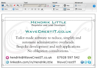
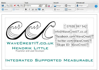
Images are naturally a common method of making a business card more attractive or professional looking. Vistaprint allows you to upload images and display them on both the front and reverse sides of the card. Once uploaded, images can be moved, resized and have a number of colour effects applied to them. An image need not just be your logo. You could have icons for your contact details, custom bullet points, pictures demonstrating your products or services or a self portrait. You could even design your whole card as an image, outside of Vistaprint, and upload it as a single object before printing it. It is that last technique that we will touch on in this article.
The downside of having an image rich business card from Vistaprint is, of course, cost. Vistaprint charge you a significant surcharge (typically about 30% of the base cost of the card) for each uploaded image on your printed card. But here's the good news: I'm going to tell you how to completely circumvent these additional charges and how, with some additional work, you can only be charged for printing a single image.
Warning: This technique is a relatively complex and time-consuming, relies heavily on methods decribed earlier in this series and involves some arithmetic and a significant amount of image preparation, outside of Vistaprint. The upside is that the savings are potentially considerable. I reduced the cost of two hundred and fifty business cards, on a twenty-one day order, from over £35 to less than £13 by combining seven images into one, using the method below. That's a saving of over sixty-five percent!

Combining Images into a Single File
The first step is to design your business card in Vistaprint, using as many uploaded images as you want, arranged however you choose. Next, save this card and then save a copy of the card under a different name. We will work in this copy and preserve the original in case any errors ocurr in the re-design process.


Delete any text object that overlays or comes close to an image. Then save a bitmap image of your card, as described in this earlier article. This image will be used as a template for creating a single image combination of all the images used in your card, at the highest possible resolution, ie. the best possible image quality.


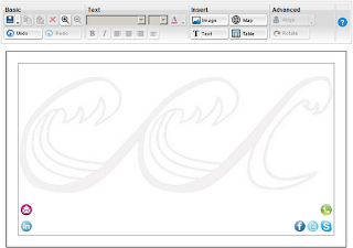
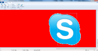
Load the bitmap image into Microsoft Paint. Now, in a separate copy of Paint, load the image you had to scale up the least or down the most, in order for it to appear the correct size on your business card. We will refer to this as the hi-res image. As an example, I used seven images for my card, a logo that I had turned into a watermark (as described in this article) and six icons which I use to illustrate different forms of media that I can be contacted on. These icons were taken from different sources and originally had different image sizes. I uploaded them as they were and scaled them in the Vistaprint card designer so that they showed as the correct size. The logo is obviously the largest image I used and the original image file I uploaded has the largest dimensions. However, as it fills most of the background of the card, I actually had to scale it up slightly, in order for it to appear the size I wanted. When I uploaded the contact icons, I had to scale all of them down somewhat, for them to appear properly. As it happens, the icon I had to scale down the most was the Skype icon, the white 'S' on the light blue background. In this example, this will be referred to as the hi-res image and the original file version of this image, that was uploaded to Vistaprint, should now be loaded into a separate copy of MS Paint.


Now, using the Select tool in Paint, click precisely on the highest point of the version of the hi-res image you have in the card image bitmap. Holding down the mouse button, move the bottom of the Select area to the precise lowest point of the hi-res image and release the mouse button. You may want to zoom the screen in to make this process easier. In the status bar at the bottom of the Paint window, second icon from the left, there should be an icon which is a dotted box outline with two arrows, one to the left pointing up and one below, pointing right. The figures to the right of this icon tell you the dimensions of the select area. The right hand one tells you the height, in pixels. This is the figure we are interested in. In my example, the figure is 45px.


Next, follow the same procedure for the original file for the hi-res image. You may be able to simply select the entire image, if the original image has no borders or other space or imagery around it. In my example, this was not the case. The height of the hi-res image, in my example of the original file, is 90px.


Okay, here comes the maths. Divide the height of the image in the original file by the height in the card bitmap image. In my example, this is co-incidentally very easy, as it is 90/45 which equals exactly 2. Your figure is likely to not be so precise but don't worry about this too much. Now multiply that number by 100 and store it in your calculator memory, or write it down. You now only need the figures before the decimal point.

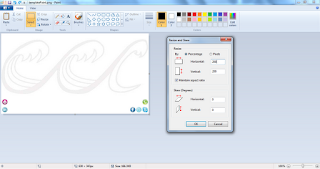
In the card image bitmap (which we are using as the template for the combined images, remember) de-select any parts of the screen. You can do this by simply clicking on the 'Fill' icon, for example. Now click on 'Resize' and tick the 'Maintain aspect ratio' check box. Type the calculated figure into the 'Horizontal' text box. The same figure should be repeated below, in the 'Vertical' box. If not, type it in yourself. Click 'OK'. The whole image should now have been rescaled to match the resolution of the hi-res image. 


Copy the hi-res image from the orginal file and paste it over the lower quality image in the scaled card image bitmap. Now save the card image bitmap, with a different name. This file is now the combined image template.


You now need to re-scale all of the component images to match the resolution of the template image. (Sigh. I told you it was involved. Just keep thinking of the savings!) To do this, measure their heights in the template and their original files and calculate the scaling factor, as before. Then select the images from the original files and perform the re-scaling procedure using 'Resize', again, as you did earlier. Because you have a selection this time, only that selection will be re-scaled, not the entire image. Copy the selection and paste it into the template image, over the corresponding, lower resolution image. Repeat this procedure for all of your component images, saving under a different version name each time, in case of mistakes.
[Edit 17:25 20/09/2012 : I haven't done it in the illustration but don't forget to re-scale your main logo in the same way as all the other images!]
 Once this is done, you should hopefully have a combined image, suitable for uploading to Vistaprint! You may feel the need to do a little cleaning up of the image first, using the 'Eraser' tool or some other technique.


Don't be concerned that some of the images may appear to be of varying quality, they are at the maximum quality that they could be. Remember that you originally had them re-scaled in Vistaprint, where they appeared much smaller and it was hence more difficult to judge their resolution.
Open your original card design in Vistaprint. Save it under a different name. Delete all the images. Upload the template image to Vistaprint. The quality of the image as it is displayed should be the same as the original card design and, after a little re-scaling and moving around, it should align properly with the text and any other objects in the layout. Done!
When you come to print the card, you should note that you are now only being charged for a single image, and not for multiple images, as you were before. You're welcome!

This is the last of my articles on Vistaprint, for the moment. Next time we will talk about various strategies for getting the most value out of the business networking site, Linked In.


[Edit 30/03/2013]
You can now download the Combining Images into a Single File article as a printable PDF.


Thursday, 13 September 2012

Views on Vistaprint Pt. 4 - Using Images as Watermarks


The VistaPrint card design tool, like many desk top publishing utilities, has a facility for converting uploaded images into background watermarks. However, this feature is very limited, inasmuch as it only allows the image to occupy the full size of the reverse side of the card. In this article, we will see how to create watermark images of any size and to display them on the front of the card. This also allows colour to be used in the watermark, without paying a surcharge.
Using Images as Watermarks
A watermark is essentially a faded image that is displayed behind the text of the card. VistaPrint displays images behind overlayed text automatically so that criteria is already fulfilled. The first step, then, in creating a watermark is to take your existing image and produce a faded version of it, so we need to begin with loading the image into a graphics program. In all cases like this, you should always start off with as high a resolution version of the image as you have available, and then re-scale at the end of the procedure.
A high quality graphics program, such as Photoshop, will allow you to fade the entire image relatively easily by converting the image into a mask and increasing the brightness, while leaving the background as it is. Any anti-aliasing feature should be turned on. Simpler images, with a small number of colours, can be handled with Paint. For the purpose of illustration, we will use a black and white image, in Paint.
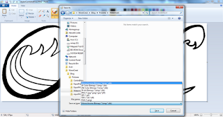
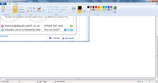
First, load the image into Paint. Paint doesn't handle high colour images very well, so we will only deal with a black and white version of the image. To do this, save the image as black and white, as shown. Paint may display several message boxes, telling you that you are about to lose colour depth or transparency. Click 'Yes' to all these options.


Next, re-save the picture as a 256 colour bitmap. You need to do this in order to restore a full palette of colours to the image. Ideally, you should save each version of the image with a different name so that if you make any mistakes, you can return to a previous version.


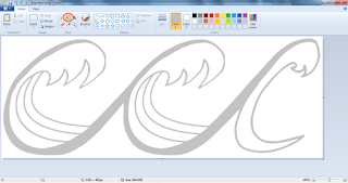
Once you have a black and white version of your image, you can re-fill it with a lighter colour. In this example, we will use the standard shade of light grey but you may want to use a different colour or a lighter shade. A wider range of colours than that depicted is available from Paint but selecting them is a somewhat complex procedure and is beyond the scope of this article.

Now that you have a faded version of your image you should save it in a standard image format such as PNG or JPG. You can then upload it to the VistaPrint editor and resize and position it as normal.


Next time, in the last of our articles on this topic, we'll be talking about combining watermarks and other images, in order to save money on VistaPrint surcharges.

Thursday, 6 September 2012

Views on Vistaprint Pt. 3 - Centring Text in the Card and Saving Your Designs as Bitmaps


Continuing our series of articles on getting the most out of the VistaPrint card design tool, this time we'll be discussing how to centre text and image objects in the card and also how to save your card designs as a bitmap.
Centring Text Objects in the Card
Nb. In common with the previous article on how to standardise object widths, this technique can be used by either aligning the borders of the sizing boxes or the borders of the object itself. In this example, the contents of the text box only just fits in to the printable area of the card, so we will use the borders of the object.
We'll start with an uncentred text object, with the text split across three lines. First align the right hand borders of the object with the right hand border of the printable area of the card.


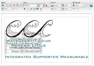
Then use the left hand sizing box of the object to align the left hand border of the object with the left hand border of the card's printable area. Ensure that the text  in the object is centre-aligned by using the Align Centre button.


You will note that the text box uses the minimum number of lines to display its contents. In order to display the text on three lines, as it was before, you need to alter the contents of the text box itself. First, make sure that the text contents control, located at the left of the screen, highlighted in blue, matches the contents of the required text box. If it doesn't, click on the text box. Then click on the highlighted text contents control. Move the cursor to the beginning of every word where you want to split the line, in turn, and press 'Return'. Your text should now be split as desired but still centred in the card.

Saving Your Card Designs as Bitmaps
The VistaPrint card design utility allows you to preserve your layouts for several months while you are offline, without deleting them,  but not indefinitely. It is a good idea, therefore, to have a copy of your card designs saved on you computer, for safekeeping. It can also be useful to have copies of your designs to show to others, without printing them, as well as for other purposes. Documents like the ones in this series, for example. We will now see how to save your card layouts as bitmaps on your own computer. Nb. This technique only works for Windows. If you use a different operating system, the method for saving the contents of the screen as a bitmap will be different and you may have to use an extra piece of software for that purpose.
We will start with a finished card layout, inside the browser. Make sure that all the contents you want to preserve are all displayed in the browser window and the browser window is active. To make sure of this, click on the title bar of the browser window. 
Next, hold down the 'Alt' key. This should be located at the bottom of the keyboard, to the left of the space bar. Then, while keeping the 'Alt' key held down, press 'PrtSc' or 'Print Screen'. You should find this key near the top right of the keyboard. It may have another command also written on the key, for example, 'SysReq'. You don't have to worry about this. The purpose of these keypresses is to copy the content of the browser window to the clipboard. If you don't know what this means, don't worry about it, just trust me!


You will now need to open up a copy of Microsoft Paint, or your favourite graphics editing program. Then paste the contents of the clipboard into the program. This can be done in Paint by selecting 'Paste' then, under that, 'Paste' again, or by pressing 'Ctrl V'.


By clicking and holding down the left mouse button on the image of the browser contents, you can move it towards the top left hand corner of the Paint window, so as to cut off anything above or to the left of your card layout. 


Then, use the scroll bars of the Paint window to bring the bottom right hand corner of the image into view. This should now have broad, white borders below and to the right of the image of the browser, as you have moved the top left part of the image out of the Paint window. Click inside the Paint window, inside the blank white area, near the bottom right of the window. This should de-select the browser image. It will also move the sizing boxes from the bottom right hand of the browser image to the bottom right hand corner of the main image. 


Now use the bottom right sizing box to eliminate the bottom right hand parts of the card image that you don't need. You can now save the image of your card design as a bitmap.


Next time, how to use an image as a watermark for your business card.


[Edit 30/03/2013]
You can now download the Centring Text Objects in the Card article as a printable PDF file.
Thursday, 30 August 2012

Views on Vistaprint Pt. 2 - Even Vertical Space Distribution


This the second in our series of articles on how to get the best from the VistaPrint business card design tool. This time we'll be talking about how to take a group of objects, that need to be displayed at different heights, and distributing the vertical space between them evenly.
Evenly Distributing Vertical Space Between Objects
You may recall from the last article that we had a set of text boxes that had all been set to the same width but had different amount of vertical space between them. We'll start from there. It should be noted, to start with, that this tip is a little bit trickier than the previous technique. We will be doing things in what may appear to be a slightly odd way, so take care.
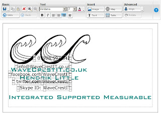
First, select the object which you want to be at the top of the group. Then move it so that its bottom sizing boxes exactly align with the bottom of the safe printing area, as in the illustration. Then move the object you want to be immediately below that so that its top sizing boxes exactly align with the bottom of the safe printing area, as shown.


Note that the controls are no longer horizontally aligned. This is fine so long as we have used the previous technique to give them all the same horizontal width. After we have evenly distributed the controls, we can re-align them by selecting them all and aligning them to the right or left and then moving them to any position we want.
Next, we need to select both of the controls and move them so that the bottom sizing boxes, of the bottom object, exactly align with the bottom of the safe printing area. Then move the third from top object so that its top sizing boxes exactly align with the bottom of the safe printing area, as in the illustration.
Again, note that the horizontal alignment of the objects is not significant at this stage.


We continue this procedure, selecting and moving an extra object each time, so that the bottom sizing boxes of the bottom object match the bottom of the safe area and then moving the next object so that it's top sizing boxes match the bottom of the area, as shown.


Still with us? Excellent because that's the hard part. All you need to do now is select all the objects, move them to a convenient position and align them to the left or right. It doesn't matter which, as, if you have followed the instructions from the previous article, all the objects will all be of the same width.


Refinements:
By now, you may well have noticed that this technique only allows you to position objects at a fixed vertical distance from each-other. To have different spacings, I suggest temporarily changing the font and text size so that the text boxes reset to a greater or lesser height, performing the procedure and then returning them to the desired font settings. You will probably have to experiment with different combinations of fonts and sizes to get the spacing you want but, having done this, you can vertically space your objects with exact precision. 
You may also find that, with larger fonts and text sizes, your text will run onto more than one line. In this case I suggest deleting sections of the text, before distributing the text boxes, and then restoring the full text after the objects have been properly positioned.
Next time, we'll talk about centring objects in the card and saving your designs as bitmaps.


[Edit 30/03/2013]
You can now download the Evenly Distributing Vertical Space Between Objects article as a printable PDF file.
Thursday, 23 August 2012

Views on Vistaprint Pt. 1 - Sizing Objects to a Single Width


For a free online utility, the Vistaprint business card design editor is quite a useful and effective tool. However there are several features, common in other automated design environments, which it lacks. Over the next few weeks, I will be demonstrating how to simulate some of these missing abilities. While the techniques that I show won't be as simple to use as those in a more advanced editor, they will allow you to create your designs more precisely and easily than just doing them by eye. This will lead to a more professional look for your cards and may gain
 you extra business or possibly just save you some money!
Standardising the Width of Objects
Given that the Vistaprint card designer has the ability to automatically align objects to the top, left, right or bottom –most out of a group, I find it somewhat surprising that it lacks this feature. Nevertheless, here is how to go about simulating it:
Nb., this technique can be used by initially aligning objects to either the leftmost or rightmost border of the card and using either the borders of the object or it's sizing boxes but in this example I will use the right-hand border of the card and the borders of the boxes. 
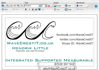
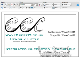
First, select all the objects you wish to have the same width (*). These can be text or image objects, in any combination. (However, I would suggest that it makes more sense to standardise the width of text objects to that of images, rather than the other way around.) Then, move all the objects so that the borders of the right-hand sizing boxes of the object furthest to the right exactly aligns with the right-hand border of the card (either the external border or the border of the printable area), as shown.


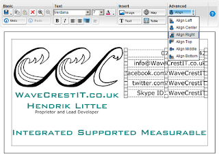
Then select 'Align Right' from the Advanced / Align drop down menu:


Then move all of the objects so that the borders of the left-hand sizing boxes, of the control you wish to standardise the width to, are precisely aligned with the left-hand border of the card.


You will then need to individually adjust the width of each object by selecting it's right-hand width sizing box and moving it so that its left-hand border exactly aligns with the left-hand border of the card. You will find that clicking on the sizing box de-selects all the other objects. Do this for each of the objects. 

Voilà! Your objects now have all the same width and can be selected and moved to a more convenient location.


Next time we'll discuss how to evenly distribute the vertical spacing between the objects.

[ (*) Edit 24/08/2012: I should probably say that to select multiple objects you hold down Shift as you click on them. ]

[Edit 30/03/2013]
You can now download the Standardising the Width of Objects article as a printable PDF file.

Sunday, 29 July 2012

Placate or provoke? Two ways a presentation can mislead its audience.


I've had occasion in recent months to note the difference between two styles of presentational speaking. One method emphasises consensus and, in the initial stages of the talk, it reassures the listeners that their expectations are being fulfilled. This creates an environment where they are content to agree with whatever is being said. So the speaker might say something like 'Who here would like to be making more money? Would you like to be making more money? I know wouldn't say "no" to some more money. I think we could all do with a bit more money, couldn't we? Of course we could.'

The second technique is more confrontational and seeks to create a debate on the topic. The speaker will try to build up interest from the audience by effectively doing the opposite of the above, ie. by asking questions or making statements that at least one person in the audience is almost guaranteed to disagree with. This also creates an atmosphere of discomfort in most of the rest of the group. One way of doing this, without looking foolish or uninformed, is for the speaker to phrase what they're saying in subtly incorrect terms. For example, they might use the term 'turnover' in a context where it only really makes sense to talk about profit. If questioned on this, they can point out that if you substitute the two terms, their argument is perfectly valid, indeed obvious. If no-one confronts them then they can make even more obvious points, using the altered terminology. This reassures the listeners that they do indeed understand what is being said, even if it is being phrased in an unfamiliar way. Again this is done in the early part of the talk.

The second strategy serves a number of purposes. If the speaker is explicitly questioned, it gives them an opportunity to put the questioner in their place, enhancing the speaker's authority. Even if this doesn't happen, by altering the language of the argument, the speaker has shifted the ground from under the audience's feet and made them slightly uncertain about what they thought they knew, thus putting them in a more susceptible mindset for the speaker's main points.

Both techniques are highly manipulative and are completely independent of the main points of the talk being in any way true or useful. I have to say however, that, given the choice between the two, the first merely seeks to keep the audience stuck in a rut and to merely accept what the speaker is spoon-feeding them. The second, at least, attempts to engage with the audience and to break them out of their accepted ways of doing things, even if it is with the sole objective of switching them over to the speakers point of view.

Don't get me wrong, I believe you need to use technique to create a good talk and conscious strategy will always have a manipulative element. However, in order to be a truly successful speaker, you should always keep in mind the ideal that all of your content (as with any service you provide) should be for the honest benefit of your consumer.